
Appearance
Importing Components
Before a React component can be dragged onto the Overlay canvas, it needs an entry in .overlay/components.jsonc. Overlay gives you a couple of ways to create those entries.
TIP
Looking to bring in a whole icon package (lucide-react, Tabler, Phosphor, or your own SVG folder) instead of individual components? See Icon libraries.
Automatic import from Shadcn/ui
If your project uses Shadcn/ui, Overlay can detect the setup and generate components.jsonc entries for you automatically.
- Open the Overlay side panel.
- Click Scan Shadcn components.
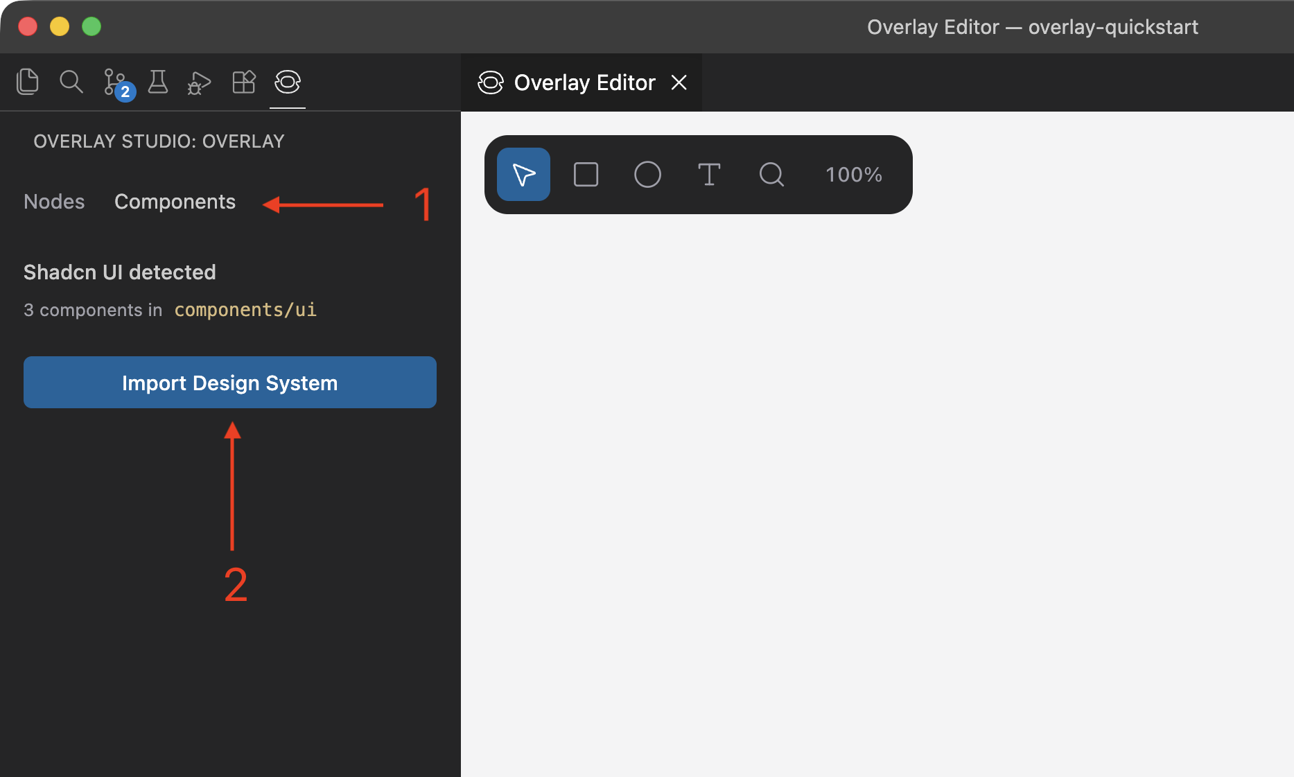
Overlay looks at each Shadcn component file and imports the exports it recognizes — Button, Card, Dialog, and the rest of the standard Shadcn component set — along with their prop types, enums (e.g. variant, size), and sensible defaults, so they render correctly on the canvas immediately.
INFO
Only exports Overlay has a built-in schema for are imported this way. Custom components, and Shadcn components with local modifications that go beyond its known props, won't be picked up by the scan — use one of the options below for those instead.
Re-running the scan is safe: it merges newly found components into the existing file rather than overwriting your entries.
AI-assisted import with the register-component MCP prompt
If you have an AI assistant connected through Overlay's MCP server, you can ask it to register a component for you. Overlay exposes this as the register-component MCP prompt, which most MCP clients surface as the slash command /overlay/register-component:
md
/overlay/register-component src/components/button.tsxPlain language works too, on clients without slash-command support for MCP prompts:
md
Register src/components/button.tsx in Overlay.When invoked, the agent:
- Reads the component's source and inspects its props — types, whether they're required, and any default values.
- Creates
.overlay/components.jsoncand.overlay/config.jsoncfirst if either is missing (without touching any existing config). - Appends an object-form entry with a full
propsdefinition — includingenumvalues for string-literal unions and"ReactNode"for slot/children props — so the component renders with realistic sample content right away. - Adds any font or CSS the component needs to
.overlay/config.jsoncif required to render it faithfully.
This is the best option for components with a non-trivial prop surface, since it produces the same detailed object-form config you'd otherwise write by hand.
TIP
You can invoke the prompt without a path too (Register this component in Overlay) — the agent will ask which file you mean if it isn't clear from context.
AI-assisted import onto the canvas with the import-component MCP prompt
register-component adds an entry to components.jsonc so a component can be dropped onto the canvas as a reusable, prop-driven instance — but the component itself stays real code, referenced by name. If instead you want to bring an existing component, or a whole page, onto the canvas as plain editable nodes you can select and restyle freely, use the import-component MCP prompt, surfaced as /overlay/import-component:
md
/overlay/import-component src/app/settings/page.tsxWhen invoked, the agent:
- Reads the source file and resolves the component to import (asking which export you mean if the file has several and it isn't clear).
- Checks your registered components and icon libraries via
get_design_system. - Rebuilds the design as canvas JSX: components already registered in
.overlay/components.jsonccome in as reusable instances, so nothing gets duplicated; everything else — custom components, and anything fromnode_modules— is expanded into native frames and text, since only workspace files can be registered by name. Icons from a configured icon library are kept as namespaced icons (e.g.<Lucide.ArrowRight />) rather than expanded. - Sizes the root to fit what's being imported — a full page typically becomes a
w-[1440px]frame. - Takes a screenshot to check the result against the source before reporting back.
Data the component would normally receive as props (list items from a .map(), values from an API) gets replaced with realistic sample content, preferring literal values already present in the source.
TIP
You can invoke the prompt without a path too (Import this page into Overlay) — the agent will ask which file you mean if it isn't clear from context. Like register-component, the path can include a named export as path:ExportName.
Which should I use?
| Situation | Recommended approach |
|---|---|
| Standard Shadcn/ui components | Automatic Shadcn import |
| Custom component with meaningful props, to reuse as a real component elsewhere | register-component prompt |
| An existing component or whole page, to redesign freely as canvas nodes | import-component prompt |
| You want full manual control over the config | Edit components.jsonc directly — see the reference |
| A whole icon package (lucide-react, Tabler, a custom SVG folder, ...) | Add an iconLibraries entry to components.jsonc — see Icon libraries |